Tony Clemendor has been a member of Founders Network since January 2013. He’s also been a prominent FN member in our Silicon Valley Chapter. To receive peer mentorship from Tony and over 600 fellow Tech Founders, please request an invite and join our global network.
Most of the information on the Internet about investor presentations is either about how to create your pitch deck and presentation from scratch or is the usual list of slides that you’re supposed to include, like “Problem”, “Solution”, etc. Founders usually get enough information from those resources to get the basics down and put together a set of slides, but not enough to really help them create an effective deck.
In my pitch advisory practice, founders rarely come to me for help in building their first deck. The more common situation is that they’ve already created a deck, used it in presentations to a few investor audiences, tried to figure out why they are not generating interest, and want to know “how they can make their deck better”.
Those founders had decks that were “done” but weren’t really ready for prime time. Among other things, the founders tended to have committed one or more of a short list of typical mistakes that routinely got them on the “Thanks for coming. Keep in touch” list.
Some of you may be lucky enough to have access to a local accelerator where, among other things, you will have access to people that can help you hone your deck. On the other hand, if all you need help with is your deck, an accelerator is overkill.
Others of you might belong to a peer to a peer founders group like The Founders Network, who provide office hours to their members and pitch practice sessions. Both of those options offer a low-risk way to get third-party feedback on your presentation and suggestions on things you can do to improve it.
Assuming that you already have a deck and you: don’t yet belong to a group, don’t want to join an accelerator today, or are just a Do-it-yourself type, I wanted to offer some help. I want to help you take a step back and see your deck from an investor’s perspective. Among other things, I sit on the selection committee for an angel group and see pitches and pitch decks all the time.
“In an investor presentation, you are delivering the story. Your deck contains the illustrations that go with the story.”
Rather than spend this post talking about how to create an investor presentation, I wanted to instead, create a checklist of sorts that you could use to see if your deck just needs a little help with the visuals or the content. I’ll then suggest specific things you can do to immediately make your presentation more effective. A generic one-size-fits-all post like this can only go so far to improve your deck, but it can certainly help you avoid a total “PitchWreck”.
The checklist I mentioned earlier has two parts. The first is the visual checklist and the second is the content checklist. Keep in mind that presentation decks are very different from decks that you email to someone or upload when you apply for funding like you would on Gust. In this post, the checklist is for presentation decks.
The Visual Checklist
The visual checklist is about the impression that your deck makes. It helps if you understand a basic truth first: Your deck is not a teleprompter and is also not designed to be read by you or your audience. In an investor presentation, you are delivering the story. Your deck contains the illustrations that go with the story. Like the illustrations in a storybook, your deck should create some emotional response, create a connection, or emphasize something you want your audience to know or remember.
Your audience can’t really do two things at once well. In this case, they can’t read and analyze your slides and listen to you at the same time. You want them to be impressed with you, not your slides. Your audience also can’t remember more than a certain amount of information, so don’t overwhelm them with complexity. Your slides are not really there to convey information. That’s your job. Your slides should connect information with a feeling.
For both parts of the checklist, you will have to run through your slides quickly. For the visual checklist, try and approximate the perspective of your potential audience. In other words, don’t just sit in front of your computer, connect to a screen and sit in the back of the room with your remote. Try and get a sense of how your audience will be able to see your presentation.
Run through your deck looking at each slide for something less than 10 seconds per slide, then close your eyes. Ask yourself:
- What do you remember most from that slide?
- What did you want people to take away from that slide?
- Were those two things the same?
- Can you read everything on the slide in the few seconds?
- Did the images on the slide make you feel anything?
- Did they enhance the key takeaway? The key emotion?
- Did everything you saw on the slide seem to be easy to understand?
- Did you automatically “get” what the slide was trying to tell you?
There are many more questions you can ask, but these are a good start. Write down your main takeaway after each slide as a list. You’ll want to read through the list and see if you think that the sequence of takeaways makes sense.
You (and your audience) should be able to digest everything meaningful on your slide in 3-6 seconds. And if there is anything on your slide that isn’t meaningful, it’s just a distraction.
For any slide where there was a disconnect between the message you wanted to convey and your actual takeaway, go back to that slide and think about what’s causing the disconnect. Was it the phrasing? Something on the slide that was distracting or off message? Did the image clash with the message?
For any slide where you were not able to read all of the text in a few seconds, the simple answer is grab your red pen and cut down words. In a world with Twitter character limits, having few words on a slide should be easy. Remember that the sizzle is in your script. You are the star. Your deck is your backup singer. You (and your audience) should be able to digest everything meaningful on your slide in 3-6 seconds. And if there is anything on your slide that isn’t meaningful, it’s just a distraction.
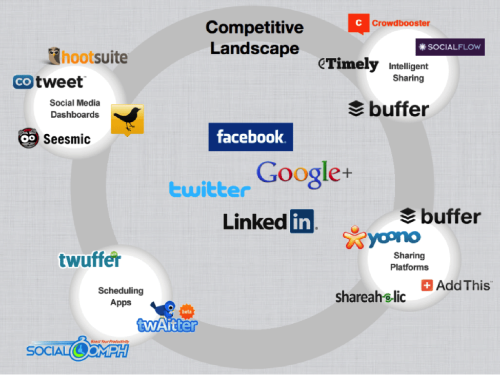
Pay particular attention to any graphics you presented. The biggest visual crimes seem to happen with the visuals. For example, if you use a competitor matrix, don’t have 20 companies in the matrix. Don’t make your axes difficult to understand. The slide below came from a deck that had success in raising funds, but they also had tremendous traction and made money before they started fundraising. While the traction info in their deck was great, their competition slide was pretty bad. It was so bad that you might not even be able to tell which company the deck was for (I’ll tell you later). Can you see a clear winner in the slide in less than 10 seconds?

The Content Checklist
The second part of the checklist is the content side. While most of the templates out there talk about what slides you need to include, they should really talk about what “content”. Investors are looking for certain information. Most don’t care if you give each piece of information on its own unique slide, as long as they get what they are looking for.
So rather than give you the list of template headings that you’re no doubt familiar with, I’ll give you some questions and a small assignment. The way that we’ll do this section is to have you read a question, then go to the particular slide in your deck that clearly answers that question. When I say “clearly”, I mean clearly to someone that is seeing your company and your deck for the first time. I also mean “clearly” to someone whose brain is fried from the other 8 decks they saw today or the 40 decks they saw this week.
Ready?
- Who exactly is experiencing the pain you are solving?
- What evidence do you have that it’s a meaningful pain point to that person?
- What have you actually done so far (what have you created, who have you spoken to)?
- How would a user interact with your product/service?
- How does the user interaction specifically solve/reduce the pain point?
- What evidence do you have that customers would switch from the status quo to your solution?
- If you don’t have evidence (i.e. traction), why do you think that customers will respond to you positively?
- How does your company make money?
- What evidence do you have that your audience will pay for your solution?
- Who is the paying customer and how do you get them in your funnel?
- What skills, experiences, and backgrounds does your team have that make them likely to be successful (going to a certain school doesn’t tell me that)?
- Why couldn’t or wouldn’t a well-funded behemoth do what you are doing?
- What is the current state of the company and product?
- What do you need to move forward and where does that get you?
- Why are you and your team the ones to bet on (remember that people invest in people)?
These are not all of the questions, but they’re questions that I see unanswered often and having a good answer for all of these will help set you apart. If you can find a clear answer to all of these questions in your slides and the answers are impressive and memorable, most people won’t care what slide you put the information on.
When your presentation makes it through both checklists with no major gaps, you already have a better deck than most. If you want bonus points, do the checklist with someone who is not part of your company. Show them the presentation and ask them the questions. You might be shocked at what they picked up and what they missed. At a minimum, the checklist approach will let you know where to focus your improvement efforts. Once you made the improvements, just rinse and repeat until you hit all of the checklist flags.
(BTW. The competition slide above was from Buffer’s $400k successful seed raise. If you want to know how they raised the money despite the bad slide, I wrote about it here.)
Good Luck!


